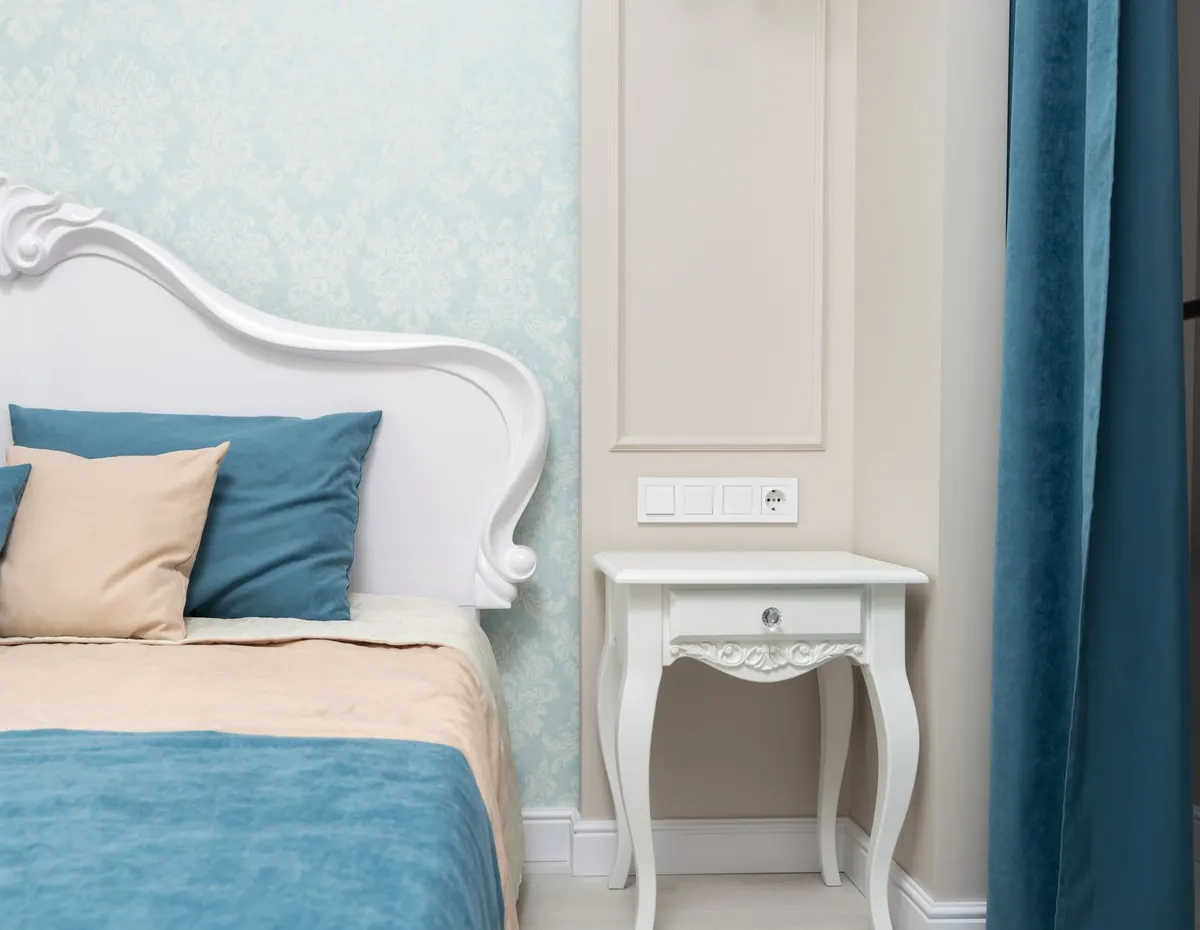
You can fall for a beautiful curtain fabric, have it made up perfectly, and still feel that something is off. More often than not, the problem is the wall behind it. Curtains cover more vertical space than almost anything else in a room, so a color that fights your paint announces itself immediately — even when you can't say exactly why. The good news: most clashes come from a small set of repeat mistakes, and each one is easy to avoid once you know what to look for.
Matching the Paint Exactly
The most common mistake is also the most understandable. You love your wall color, so you ask for curtains in the same shade. Fabric and paint almost never reproduce a color identically. Paint is opaque and flat; dye sits in the fibers, light passes through the weave, and every fold shifts the tone. The result is a curtain that is nearly the wall color but not quite — and the eye is unforgiving about near-misses. Rather than reading as a deliberate choice, it reads as a failed match, and the whole wall starts to look slightly wrong.
Instead of matching, relate. Take the wall color and move one or two steps within the same family: a soft greige wall with deeper taupe linen, a warm off-white wall with cream, a muted sage wall with a darker olive. The difference becomes legible, so it looks intentional.
Ignoring Undertones
Two beiges can genuinely dislike each other. A wall with a pink or peach undertone sitting behind a curtain with a green-grey undertone will make both look muddy, and no amount of styling rescues it. Cool grey drapes against warm cream walls are the classic version: the cream turns faintly yellow, the grey turns faintly blue, and the room never settles.
Compare undertones before you compare colors. Warm walls — cream, sand, greige, terracotta, warm grey — sit comfortably with warm or neutral curtains: oatmeal, camel, olive, clay, warm charcoal. Cool walls — blue-grey, cool white, lavender-grey — take cool or crisp neutrals: slate, dove grey, blue-white, soft navy.
A five-second undertone test
Hold the fabric sample against a plain sheet of white paper, then against the wall. Against white, the undertone shows itself: pink, yellow, green or blue. If the fabric's undertone and the wall's undertone point in different directions, put the sample down. If they agree, you are most of the way there.
Judging the Fabric in the Wrong Light
A fabric that looks superb under shop spotlights can turn grey, green or washed out at home. It is easy to choose curtains at night under warm bulbs, then hang them in a north-facing room and wonder why the color has died. Curtains also hang in front of a window, which means they are backlit for much of the day — an effect that lightens and desaturates most fabrics, sometimes dramatically.
Ask for a sample, or buy a single panel you can return, and pin it against the wall near the window. Look at it at three moments: mid-morning, late afternoon, and with the lamps on in the evening. If it holds its color through all three, it is the right one. South- and west-facing rooms are the toughest test, because strong sun pushes warm colors toward orange and cool colors toward grey.
Choosing Curtains in Isolation
A curtain that agrees with the wall but ignores the floor, the trim and the sofa is a curtain that never quite belongs. Curtains work as a bridge: they hang beside the wall, above the floor and next to the furniture, so they need to agree with at least two of those things.
- Pull one color from the rug or the sofa and repeat it on the curtain in a softer, quieter version.
- Notice your trim. Bright white trim against a warm wall invites warm white or cream curtains, not stark white.
- Check the floor. Warm oak boards and cool grey curtains can leave a room feeling cold even when everything else is right.
- Consider the rod and rings, especially in a small room. A dark bronze rod with pale curtains draws a strong horizontal line; a pale rod nearly disappears.
Texture and sheen matter as much as hue. Velvet swallows light and reads several shades deeper than the swatch. Linen and voile glow in daylight and seem to lift the wall color. A fabric with a slight sheen bounces the wall tone back at you, which is either the best thing in the room or the thing you notice first for the wrong reason.
Treating White as a Safe Default
White curtains are not a neutral fallback; they are a color choice with their own risks. Two whites that don't agree are worse than two colors that don't agree, because the eye forgives a clear contrast far more readily than a near-match. A cool, blue-based white in front of a warm cream wall makes the wall look dingy. White also greys out in low light, so in a dim room it can look tired by mid-afternoon.
If you want white, choose an off-white with visible texture — slubby linen, a cotton weave with some weight — and lean the white toward your wall's undertone. Cream walls take ivory and ecru; cool walls take a crisp chalk white. Sheers are more forgiving than opaque panels, because you see light through them rather than a flat surface.
Four Rules That Keep You Out of Trouble
- Never match; move one or two steps lighter or darker within the same family.
- Match undertone before you match color.
- Make sure the curtain agrees with at least two fixed elements in the room.
- Test the actual fabric in the actual room, in the morning and again in the evening.
Keep these in mind and most of the guesswork disappears. They also explain why a curtain that looked wrong in one room can look perfect after a move — the rules are about relationships, not about individual colors.
A Five-Minute Check Before You Order
Before you commit to a full set, run through this short list:
- Fabric sample taped to the wall beside the window, checked at three times of day.
- Undertone compared against both the wall and the trim.
- The curtain color repeated somewhere else in the room — rug, cushion, artwork.
- A long look from the doorway, which is where you actually see the room.
- An allowance for the fact that curtains read darker and stronger once gathered in folds.
If the sample survives that, order with confidence. If it doesn't, you have spent a week and a little on a sample rather than a sum on drapes you would quietly resent every time you walked into the room.
Photo: Max Vakhtbovych / Pexels